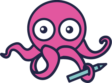
Partnering with the extremely talented illustrator and graphic designer Alexandra Stranglewicz, we developed writelingo’s logo Inky – our new visual representation.
When it comes to marketing, branding – and in particular, foundational documents – it’s important that everything we do has some meaning. We should never just do things for the sake of doing them.
A lot of companies have a logo that represents who they are and what they do but seldom do we get an explanation about why they chose that image.
The discovery process
Working with our designer, we went through a discovery process. We discussed what our values are as a company and selected from other images we liked and disliked. We were asked to give a list of ideas that we’d want writelingo’s logo to represent.
The ideas we wanted our logo to represent include:
- creativity
- uniqueness
- Youthfulness
- techy
- writing
- simplicity
Creativity: Naturally, we offer creative services. Writing copy that exceeds your expectations yet is still within your brief and guidelines.
Uniqueness: Your company is different and special, and it’s so important to us at the copy we provide you with is just as unique as you.
Tech: As we primarily target tech companies, we wanted something that demonstrated that – however, it was decided not to go this route as we didn’t want to turn away our other clients who aren’t in the tech industry.
Writing: Well, this one should be obvious! Writing is what we do, and what we’re passionate about.
Simplicity: It’s so crucial to keep copy simple – and our cooperation. We make great efforts to keep things simple in order to be able to make a bigger impact and be able to have fun while we’re working together.

Why an Octopus?
In addition to the ideas already mentioned, we felt that Aleksandra really had a great understanding of how we do, and what we do. One of the suggestions was to find an icon that was different, not overused.
The concept of the octopus came up because Aleksandra recognized that we are multitaskers, who work with tech companies, but also write for P&G brands and Kraft-Heinz Innovation products.
Of course, I had to google what an octopus represents, and was pleasantly surprised. Most sources suggested similar meanings like versatility, dexterity, intelligence and awareness. And we thought “Well, that seems fitting for writelingo’s logo!”
Do unto others
As a content creation agency that helps tech companies take their marketing efforts to the next level, we need to lead by example.
This might seem intimidating, but we feel like it comes naturally. We want to stand out from the other copywriting agencies and content creators – we want to be memorable and catch your eye. Then we bring these same ideals to you when working on your projects.
We’re excited to share our new logo. The design process was so much fun, and we look forward to adding this little one wherever we can!
